Showing posts with label posters. Show all posts

Saturday, November 27, 2010

Field Notes -- Typography in Australian Graphic Design

Our reading this week discussed Typography in Graphic Design, and I read it while on my looonnnngg flight to Australia; I decided before I landed that my research this week would be in how the Australians were using Typography in their Graphic Design.

from http://www.paulvickersdesign.blogspot.com/
an excellent blog I highly recommend
It took about 5 seconds to find the first example; Vodaphone has a Sydney campaign that is plastered on the luggage carts trolleys they have in Customs (pictured right).

This is part of the "Go Global" campaign, and features three posters: this one pictured, one of the continent of Australia, and the final of Planet Earth.  Since these subsequently zoom farther out in view, the entire campaign echoes the global theme when viewed as a whole as well as individually.  The ads are a collaborative between Aussie advertising agency JWT, Yello Brands and Am I Collective.


Although it was originally created in 2007, Australia Post's ad campaign to get people to send more letters has proved so popular that they are still prevalent today; this one was one a bus stop just outside the airport*.  The campaign pictures various people interacting; one of the people is pictured normally, the other appears like they are made out of the letter background.   The tagline: “If you really want to touch someone, send them a letter”.  The campaign has won a number of awards and has been mentioned in numerous publications:


http://theinspirationroom.com/daily/2007/australia-post-touch/
These posters remind me a lot of Stefan Sagmeister's work where he wrote on people such as Lou Reed, albeit a very toned down, Hallmark-type variation.  According to the blog, The Inspiration Room, the print advertisement was developed at M&C Saatchi, Melbourne, by creative director Steve Crawford, head of art Murray Bransgrove, art director Rebecca Hannah and copywriter Doogie Chapman, with photographer Christopher Tovo and retoucher Ed Croll.


http://www.bos17.com/

The 17th Biennale of Sydney (right) was recently held last August and there are still a few of their posters up around town and brochures in the Sydney hotel lobbies.  I included it here not just because the graphic design of the poster is visually interesting, but because it is integrated with its website,  forming a great example of graphic design carrying through as a total corporate image.  Barnbrook's Australia division was the ad agency:

My last example came from a magazine ad for Himage, a company that produces mens' grooming products.  The Australian typographer and graphic designer is Andi Yanto.  I really loved how he used the type, giving the feeling of shaving in an unexpected twist.

 
picture by me!  Magazine is OZ G7
 *I got a terrible picture of it and was declared "barmy" (ie crazy) by the Aussie friends I am staying with!

Tuesday, November 23, 2010

Field Notes: Heinz Edelmann, Graphic Artist

I was originally going to write about Peter Max, who I thought had done the Beatle's Yellow Submarine art.  However, when I looked it up, I found that I was wrong -- a graphic artist named Heinz Edelmann had done it, and that I wasn't the only one who had made the Max assumption.  Many articles referred to the "Max-influenced" work that Edelmann did on Yellow Submarine, and the similarities are very easy to see:

Peter Max's "Border Crossing 3"
from http://rogallery.com/Max_peter/prints/1970/max-border_crossing-3.htm

Heinz Edelmann, still from 'Yellow Submarine'

Edelmann was born in 1934 in Czechoslovakia and upon graduating in the 1950s from the Academy of Fine Arts in Dusseldorf, he began work as a freelance designer, illustrator, animator and teacher.  He was known for combining Impressionist and Expressionist elements with humor and irony.  In the 1960s, he was experimenting with updated Art Nouveau styles when his work was spotted by Al Brodax, the producer of an animated Beatles cartoon series for children.  He was subsequently hired to produce the artwork for the Yellow Submarine film, which would become his hallmark.  

He continued to work in graphic arts up until April 2008, about a year before his death in 2009.  Some other examples of his work:

Book Cover for the German edition
of "Lord of the Rings"
from http://www.tumblr.com/tagged/Heinz+Edelmann/page/2/1125260460
Movie Poster
http://8ate.blogspot.com/2009/07/rare-vintage-heinz-edelmann-1967.html


Monday, November 1, 2010

Field Notes: It goes both ways; Asian Posters in the 1920s

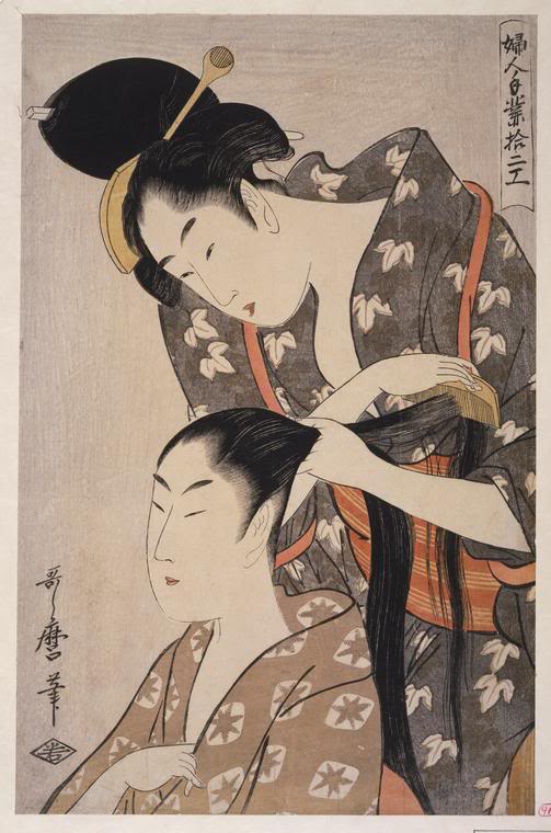
Ukiyo-e by Kitagawa Utamaro
While doing our reading, I noticed that the book only deals with Graphic Art and Design influences in Europe and America during this period, while only noting the influence that Japanism had on it.  This week I kept wondering if and how Japan was influenced by what was going on in Europe and America, and I did some research on Asian posters of this period.

When our book left off, we were admiring Ukiyo-e, or Japanese woodblocks by masters such as Kitagawa Utamaro (left), with a restrained color pallette, simple composition and much less detail than most Victorian graphics.  This influenced the Art Nouveau and Arts & Crafts movements greatly in Europe and America. 


However, I found the influence was two ways, as one can see from looking at various posters during the time frame we've read about this week.  For example, this 1926 poster for the National Industrial Expo in Himeji has a distinct Western, Art Deco flavor while still retaining a distinct Japanese style.


By the 1930s, the Plakatsitl movement had a direct influence on Japanese posters with its spare style.  The poster for a Horse Exposition (1933) and one for an Exposition in Yokohama (1935) both show the graphical influence.  The above poster and the two below, plus many more, are on the website http://pinktentacle.com/2010/02/vintage-japanese-industrial-expo-posters/


I also found it interesting that Japan had a leftist movement in the 1930s, and those posters showed a heavy Western influence.  So in addition to new political ideas, they also got new graphic ideas.  From the webiste http://www.dieselpunks.org/profiles/blogs/leftist-posters-from-japan which has many more: